
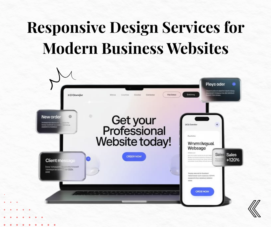
In today’s digital world, your website is often the first interaction customers have with your business. Within seconds, visitors decide whether they want to stay or leave based on how your website looks, loads, and functions. If your website doesn’t adapt properly across smartphones, tablets, laptops, and desktops, you’re likely losing valuable traffic, leads, and revenue.
This is where responsive design becomes essential.
A responsive website automatically adjusts its layout, images, text, and navigation to provide an excellent user experience regardless of the device being used. Whether someone visits your website from a mobile phone during their commute or from a desktop at work, the experience remains smooth and consistent.
As businesses increasingly rely on digital marketing, investing in responsive web design services is no longer optional—it’s a competitive advantage.
This comprehensive guide explains everything you need to know about responsive design, why it matters, what competitors are doing, the latest best practices, and how Digizebra helps businesses build high-performing responsive websites that convert visitors into customers.
What is Responsive Design?
Responsive design is a web development approach where a website automatically adjusts its content, images, navigation, and layout according to different screen sizes and devices.
Instead of creating separate websites for desktop and mobile users, responsive design allows businesses to maintain one website that works seamlessly everywhere.
A responsive website automatically adapts to:
- Smartphones
- Tablets
- Laptops
- Desktop computers
- Large monitors
- Smart TVs
This flexibility ensures every visitor enjoys a consistent browsing experience.
Why Responsive Design Matters More Than Ever
Over the last few years, mobile internet usage has overtaken desktop browsing in many industries. Customers now search for products, compare services, book appointments, and complete purchases directly from their smartphones.
If your website isn’t mobile-friendly, visitors may experience:
- Tiny unreadable text
- Broken layouts
- Difficult navigation
- Slow-loading pages
- Poor checkout experience
These issues increase bounce rates and reduce conversions.
Responsive design solves these problems by delivering a user-friendly experience on every screen size.
Competitor Analysis: What Top Web Design Agencies Are Doing
After analyzing leading agencies offering responsive design services, several common strategies emerge.
1. Mobile-First Development
Top agencies now build websites starting with mobile devices before scaling up for desktops.
Why?
Because Google primarily evaluates the mobile version of your website.
2. Speed Optimization
Leading agencies focus heavily on website performance.
They optimize:
- Images
- CSS
- JavaScript
- Fonts
- Server response time
- Lazy loading
Fast websites consistently outperform slow competitors.
3. User Experience (UX)
Successful agencies don’t just create attractive websites.
They prioritize:
- Clear navigation
- Easy readability
- Strong call-to-action buttons
- Minimal distractions
- Logical page hierarchy
Better user experience directly improves conversions.
4. SEO-Friendly Architecture
Top-performing websites include:
- Clean URLs
- Schema markup
- Optimized headings
- Internal linking
- Fast-loading pages
- Mobile optimization
These technical improvements help websites rank higher in search results.
5. Conversion-Focused Design
Leading agencies treat every webpage as a sales tool.
Instead of simply looking beautiful, every section encourages visitors to:
- Contact the business
- Request a quote
- Download resources
- Purchase products
- Book consultations
Responsive design and conversion optimization go hand in hand.
Benefits of Responsive Design for Businesses
1. Improved User Experience
Visitors stay longer when a website is easy to navigate.
A responsive design automatically adjusts:
- Buttons
- Images
- Menus
- Content width
- Forms
This creates a seamless browsing experience.
2. Better Google Rankings
Google prefers mobile-friendly websites.
Responsive design supports SEO by improving:
- Mobile usability
- Core Web Vitals
- Crawl efficiency
- Page experience
- User engagement
These factors contribute to better search rankings.
3. Increased Conversion Rates
A responsive website removes friction from the customer journey.
Visitors can easily:
- Browse products
- Read information
- Submit inquiries
- Complete purchases
The easier the experience, the higher the conversion rate.
4. Lower Maintenance Costs
Instead of maintaining separate desktop and mobile websites, responsive design allows businesses to manage a single website.
This reduces:
- Development costs
- Maintenance time
- Content duplication
- SEO complications
5. Faster Website Loading
Modern responsive websites use optimization techniques such as:
- Image compression
- Browser caching
- Minified CSS
- Optimized JavaScript
- Lazy loading
Fast-loading websites improve both SEO and user satisfaction.
Key Features of Professional Responsive Web Design Services
When choosing responsive web design services, look for these essential features.
Mobile-First Design
Designing for mobile users first ensures your website performs exceptionally on smaller screens before expanding to larger devices.
Flexible Grid Layouts
Responsive websites use flexible grids instead of fixed layouts.
This allows content to scale naturally across different screen sizes.
Adaptive Images
Images automatically resize based on screen dimensions.
Benefits include:
- Faster loading
- Better appearance
- Reduced bandwidth usage
Responsive Navigation
Menus automatically transform into mobile-friendly navigation without compromising usability.
Touch-Friendly Elements
Buttons and forms should be easy to tap on smartphones.
Professional responsive websites consider finger-friendly spacing.
Cross-Browser Compatibility
Your website should perform consistently on:
- Chrome
- Safari
- Firefox
- Microsoft Edge
This ensures every visitor receives the same experience.
SEO Optimization
Professional responsive web design services integrate technical SEO during development rather than treating it as an afterthought.
Key SEO elements include:
- Proper heading structure
- Meta optimization
- XML sitemap
- Robots.txt
- Structured data
- Clean code
Responsive Design vs Mobile Website
Many businesses wonder whether they need a responsive website or a separate mobile website.
| Responsive Design | Separate Mobile Website |
|---|---|
| Single website | Two websites |
| Easier maintenance | Higher maintenance |
| Better SEO | Duplicate content risks |
| Lower long-term cost | Higher development cost |
| Better user experience | Can create inconsistencies |
For most businesses, responsive design is the better long-term investment.
Industries That Benefit from Responsive Design
Responsive websites benefit nearly every industry, including:
- Healthcare
- Real Estate
- Law Firms
- Restaurants
- E-commerce
- Educational Institutions
- Startups
- Manufacturing
- IT Companies
- Digital Marketing Agencies
- Consultants
- Travel Businesses
- Finance Companies
- Local Service Providers
Regardless of industry, customers expect websites to function perfectly on every device.
Common Responsive Design Mistakes to Avoid
Many businesses unknowingly make mistakes that reduce website performance.
Avoid these common issues:
- Unoptimized images
- Tiny fonts
- Slow loading pages
- Poor mobile navigation
- Large popups
- Broken layouts
- Difficult contact forms
- Unclickable buttons
- Inconsistent spacing
- Ignoring tablet optimization
Professional responsive web design services help prevent these problems from the start.
Responsive Design and SEO: Why They Go Hand in Hand
Responsive design plays a crucial role in modern SEO strategies. Search engines favor websites that provide a smooth experience across all devices.
A responsive website helps improve:
- Mobile usability
- Core Web Vitals
- Average session duration
- Pages per session
- Lower bounce rate
- Crawl efficiency
- User engagement signals
These improvements can positively influence your search engine rankings and organic traffic over time.
How Digizebra Delivers High-Performance Responsive Websites
At Digizebra, we believe a website should do more than just look attractive—it should help your business grow. That’s why every website we build combines responsive design with SEO best practices, fast performance, and conversion-focused layouts.
Our responsive web design services include:
- Custom responsive website design
- Mobile-first development
- SEO-friendly website architecture
- Fast loading optimization
- WordPress website development
- UI/UX improvements
- Core Web Vitals optimization
- Landing page design
- Website redesign services
- Ongoing maintenance and support
Whether you’re a startup, local business, or growing enterprise, we create websites that are built to perform on every device and support your digital marketing goals.
Frequently Asked Questions (FAQs)
What is responsive design?
Responsive design is a web development approach that enables a website to automatically adjust its layout, images, and content for different screen sizes and devices.
Why is responsive design important?
It improves user experience, supports SEO, increases conversions, and ensures your website works well on mobile, tablet, and desktop devices.
Is responsive design good for SEO?
Yes. Google recommends responsive design because it improves mobile usability, page experience, and crawl efficiency.
How much do responsive web design services cost?
The cost depends on the website’s size, features, customization, and functionality. A professional agency can provide a tailored solution based on your business needs.
Can an existing website be made responsive?
Yes. In many cases, an existing website can be redesigned or updated to become fully responsive without rebuilding everything from scratch.
Final Thoughts
Your website is one of the most valuable assets for your business. As customer expectations continue to evolve, having a responsive website is no longer optional—it’s a necessity for delivering a seamless user experience and staying competitive online.
Businesses that invest in responsive design enjoy better search visibility, higher engagement, stronger conversion rates, and improved customer satisfaction.
If you’re looking to build a modern, SEO-friendly website that performs flawlessly across all devices, Digizebra is here to help. Our team combines responsive design, technical expertise, and digital marketing knowledge to create websites that not only look exceptional but also drive measurable business growth.
Ready to future-proof your website? Contact Digizebra today and discover how our responsive web design services can help your business succeed in the digital age.